Executive cars, whether hailing from Germany, the UK or Japan, have generally wooed buyers with their sumptuous interiors full of neat details and features. If that is what you have come to expect from your car, you will be instantly turned off by the Model Y.
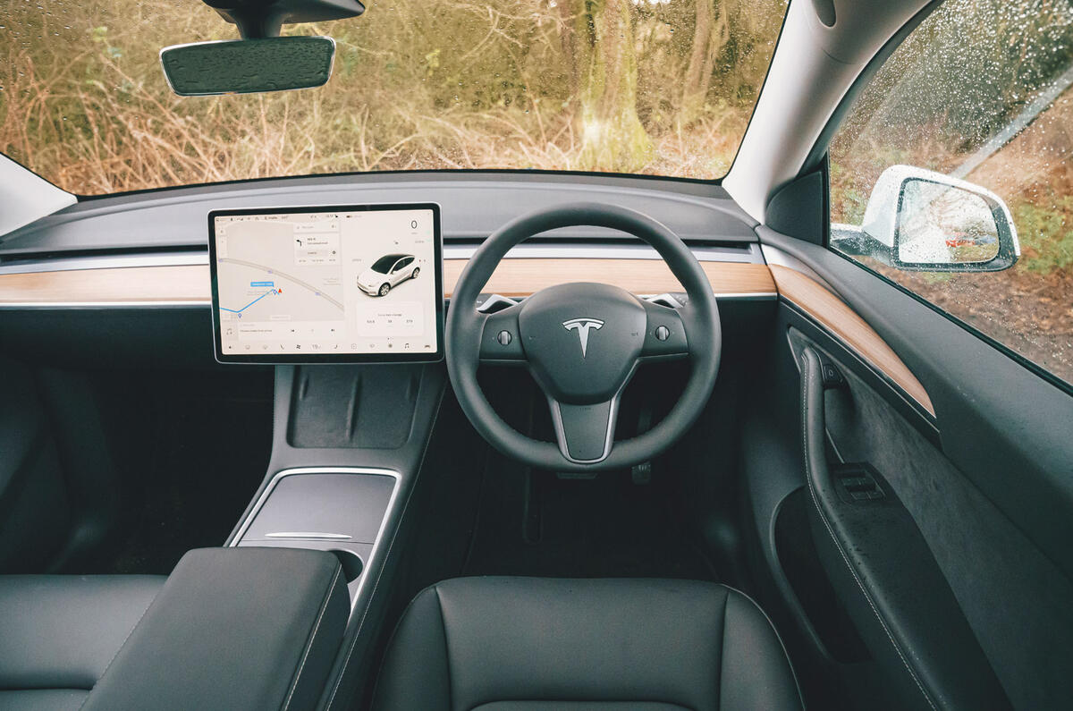
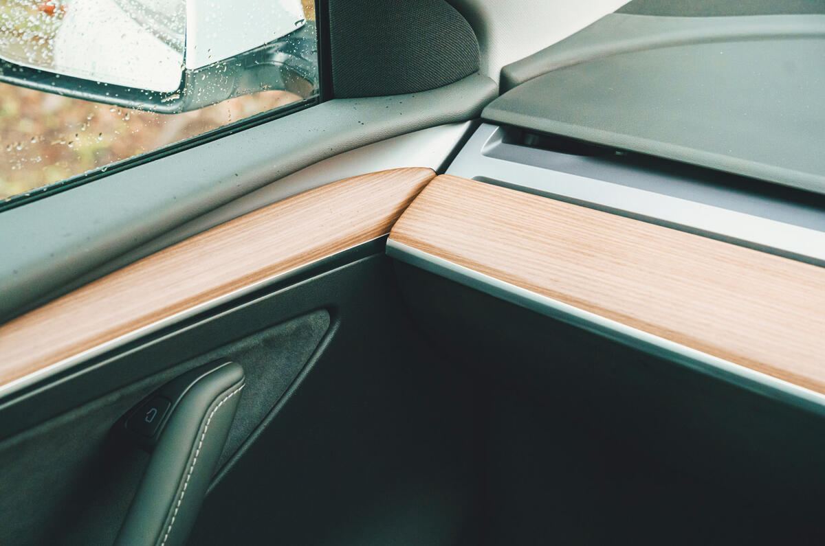
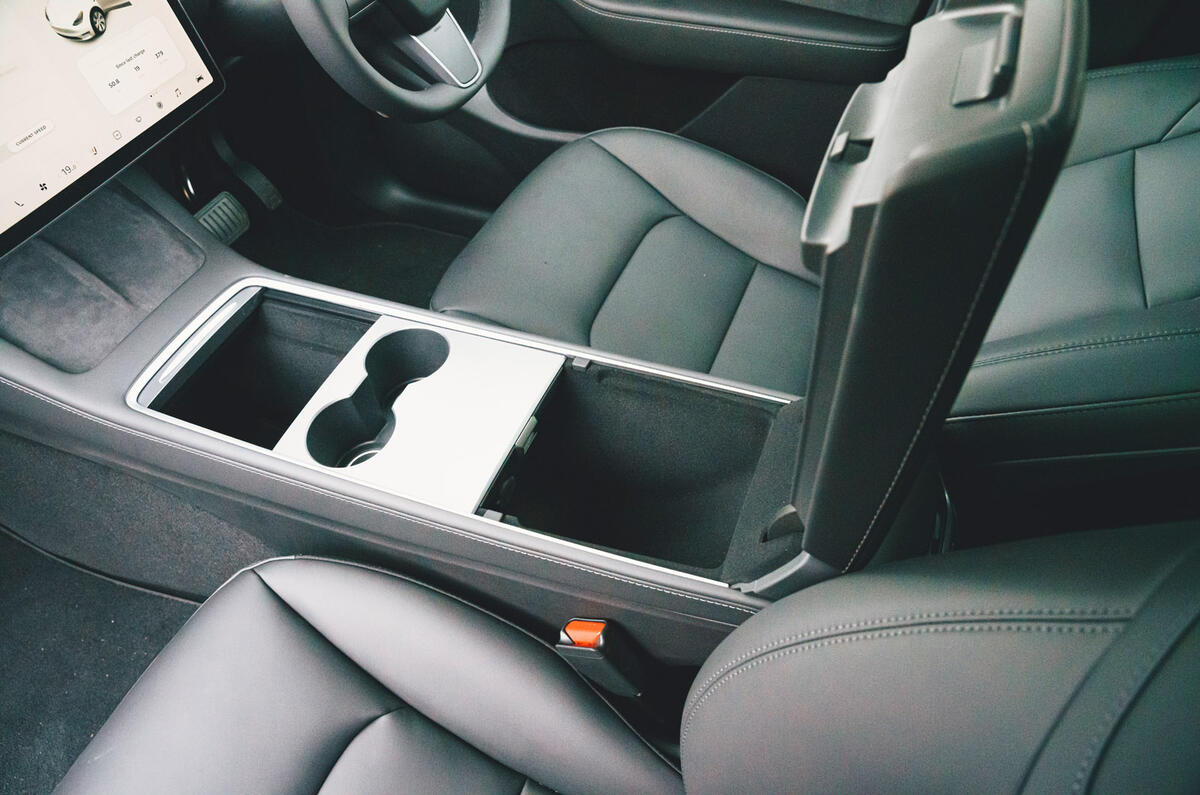
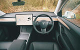
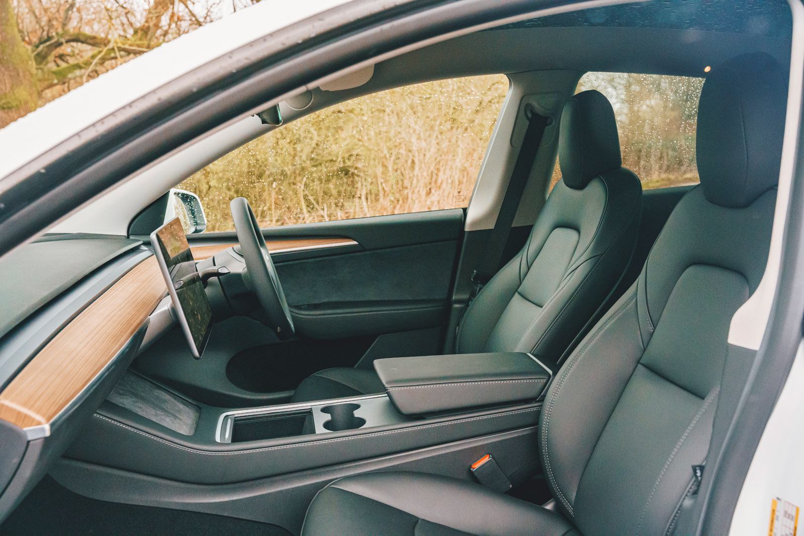
Its interior, like in every other Tesla, is minimalism driven to its logical conclusion. There is almost nothing in there that doesn’t need to be there, and that includes buttons. The only piece of style over minimalism is the strip of natural-looking wood on the dashboard.
Teslas have gained a reputation for flaky build quality, but from the evidence of our test car at least, that is undeserved. Everything inside the Model Y gave a sturdy impression and all surfaces felt pleasing to the touch. Apart from the touchscreen, they resisted fingerprints well.
It’s all fully vegan. That thought might give some people flashbacks to nasty vinyl seats, but in reality you couldn’t tell that the seats aren’t made of real leather. As standard it is black imitation leather, or for a rather steep £1100 you can have white seats.
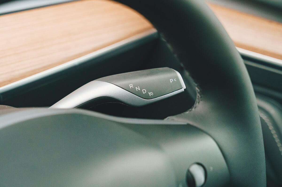
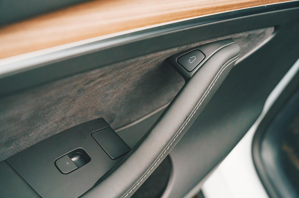
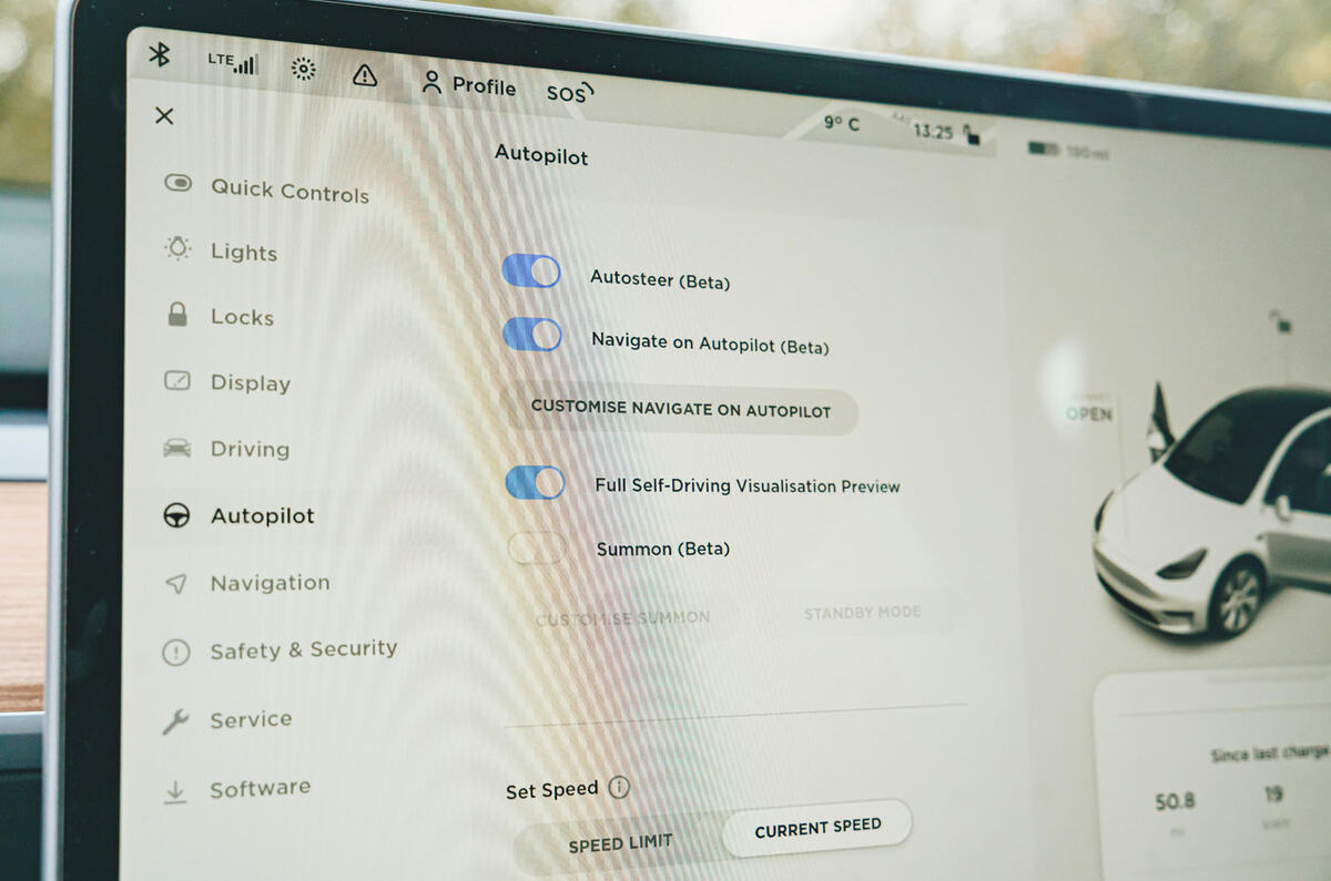
As well as imitation leather, you better like touchscreens, because in a Tesla interior there isn’t a whole lot else to touch. The reduction in physical controls isn’t quite as pronounced as in the latest Tesla Model S, which forgoes even the indicator stalk and drive selector, but apart from those, all you get in the Model Y is seat controls, a button for the hazards, window switches and two multifunction controls on the surprisingly round steering wheel.
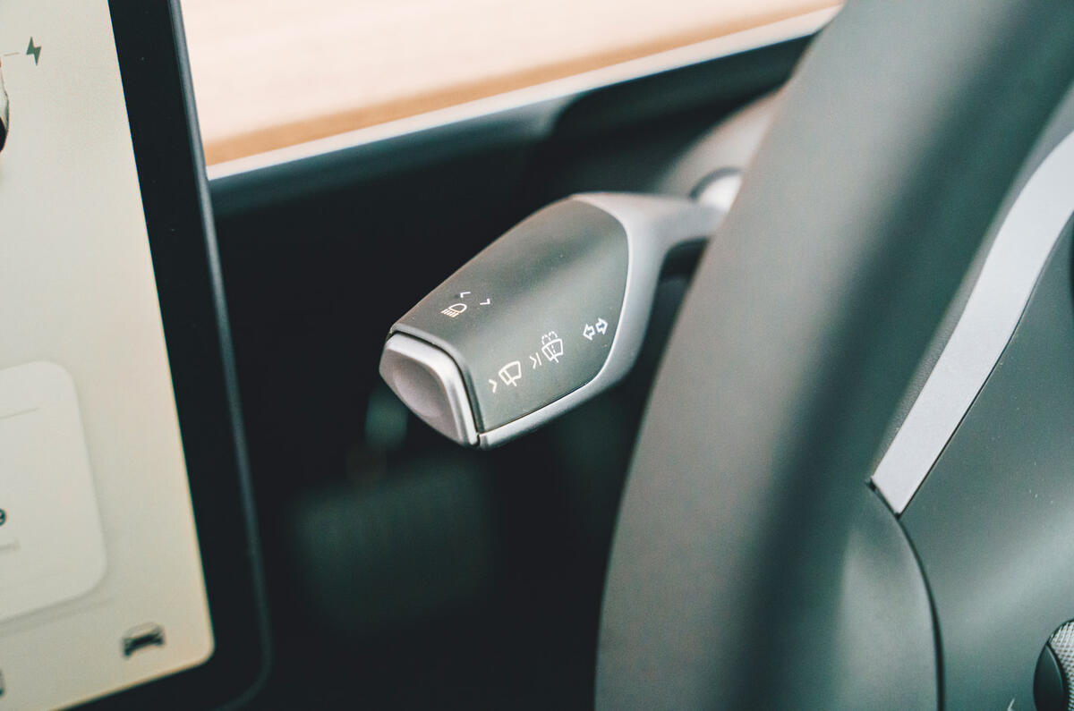
Given how few controls there are, it works fairly well, mainly because the screen reacts very quickly and there aren’t many deep submenus. Some controls are also cleverly dual-purpose. For example, there is no wiper stalk, just a button on the indicator stalk. Press it lightly for the mist function, or harder for a wash-wipe. Either way, it also pops up a menu on the screen to adjust speeds.
Even so, there are compromises. Adjusting the steering column or mirrors by first going into a menu and then using the steering wheel buttons is absurd. The ‘buttons’ for the climate control are too small, and although there are rear seat heaters, rear passengers can’t activate them because it is done only through the screen. Forget trendy minimalism, this is pure cost-cutting.
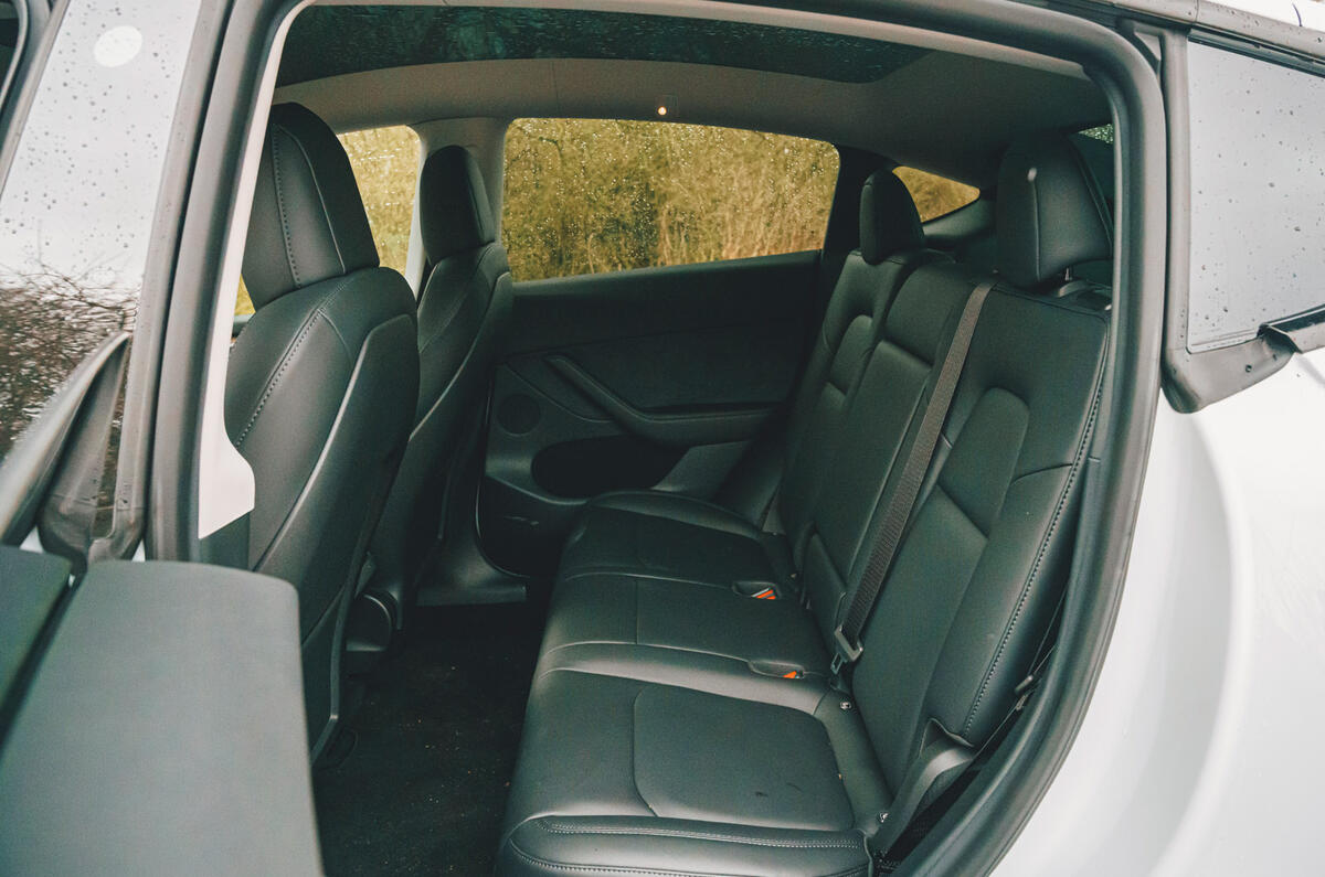
Where the interior excels is in the sheer amount of space it offers, much more than any of its rivals. Rear leg and head room are generous, but the bench is set higher in relation to the floor than in a Kia EV6, which creates a more comfortable seating position.
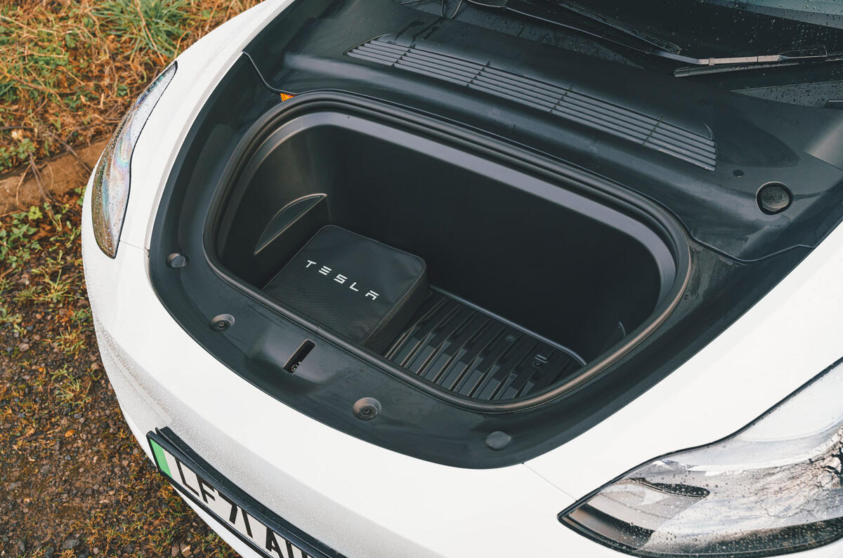
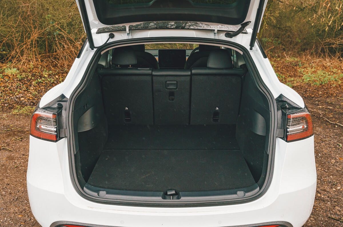
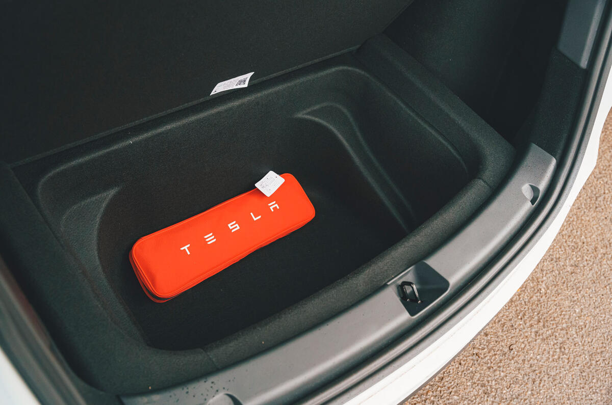
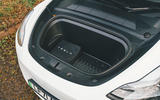
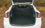
Tesla fudges its boot volume numbers a bit by quoting up to the roof, rather than the parcel shelf (because there isn’t one), but by our own measurements it is still larger in every direction than either the EV6 or the Skoda Enyaq, and there is a large area under the floor. To embarrass other cars further, there is also an impressive 117-litre ‘frunk’ that can be opened electronically.
Tesla Model 3 infotainment and sat-nav
Tesla is by no means the only manufacturer to eliminate buttons in favour of a massive touchscreen, but it could be argued that it was the first to do so semi-convincingly.
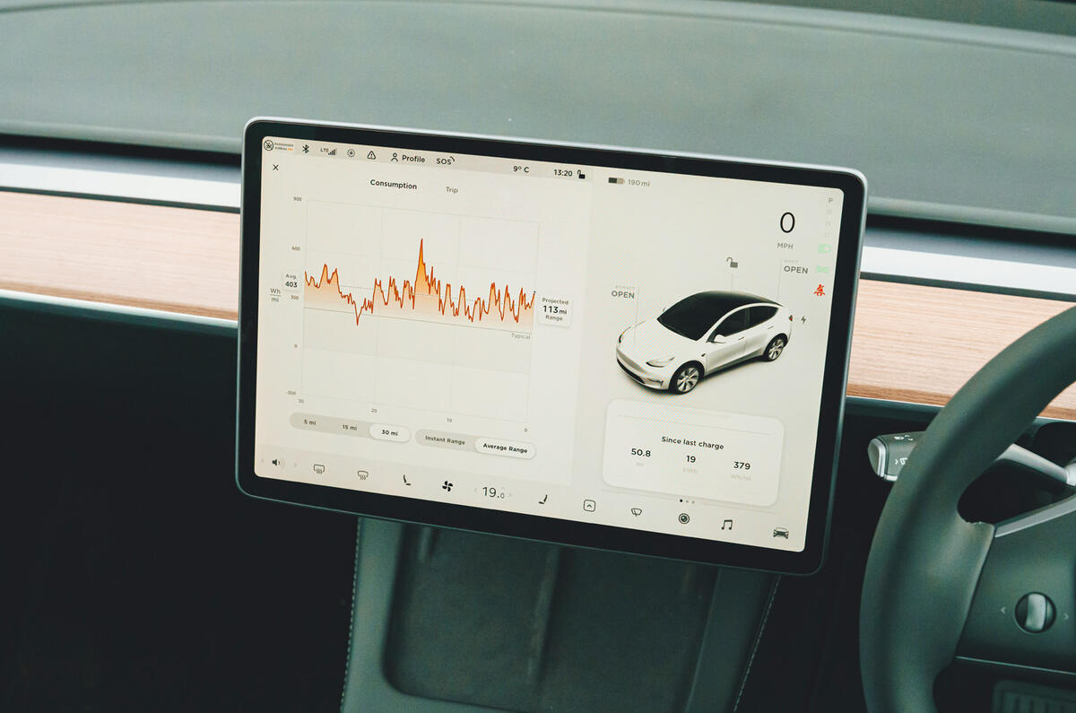
That is still the case to some extent, because at 15in the screen is huge, allowing large on-screen buttons. It responds instantly and most menus are clear and only one or two levels deep. There are also abundant USB ports and two wireless chargers.
However, the buttons for the climate control are too small, and there is no Apple CarPlay or Android Auto functionality, so if you want to use Apple Podcasts or Music, you have to do so through Bluetooth. At least Spotify is built in.
The navigation is Google Maps, which is mostly a good thing, but it doesn’t always work right if there is no mobile signal and the voice guidance is a bit too chatty.


